What is mobile-first index?
For close to a year, we have been hearing a lot about mobile-first indexing, and how Google is making the imminent transition to reflect user behaviour trends & to make the web mobile-friendly. Despite the chatter, there is a lot of confusion around what exactly it means for business owners. Will they have to change anything and/or everything? Will making the site mobile-friendly be good enough? Will you have to create a mobile site if currently you only have a desktop version?
Mobile-first indexing is what it sounds like. It simply means that your website’s mobile version will be the first thing for Google to include in their index, making it the baseline for how they ascertain rankings.
It’s called ‘mobile-first’ as it’s not a mobile-only index, contrary to the popular belief. For instance, if a business doesn’t have a mobile-site, its desktop site will be included in the index. However, the lack of a mobile site can impact its ranking as compared with a site with a better mobile experience as it will receive a boost in rankings including searchers on a desktop.
What is the need for the transition?
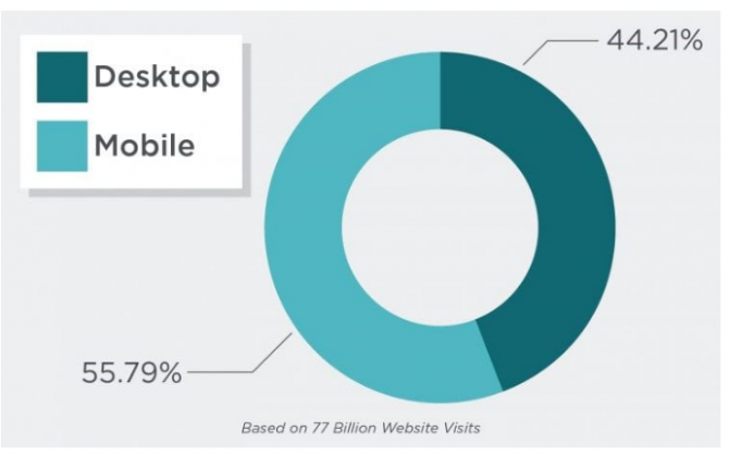
Over 55% of all traffic now comes from a mobile device, as per a recent study conducted by Stone Temple Consulting this year. While the mobile searches are rising, it doesn’t mean the desktop is dead (44% of traffic is not a small stat to ignore!). This transition, on the other hand, poses a question for Google - should business owners be looking at mobile experience solely since users are migrating toward mobile devices?
Source: Search Engine Journal
The answer to this question is yes, as Google is currently testing this approach. This again poses a question for business owners - should they prepare their site for mobile-indexing, if yes, then how?
When is it launching?
Google has already started testing the mobile-first index, but we are still months away from this getting fully implemented for the end user. Since there is no set date for the roll out, if things go well, Google may even push it sooner, if required. In case things don’t go their way, they may even roll it back. Although Google has said that they will push it to more searchers over the next few months to become more confident with mobile-first index.
What would be the impact on SEO?
Google ranks your mobile site as per the signals from your desktop site. This process will flip now, and Google will rank your mobile and desktop site as per the signals they get from a mobile view from crawling your site.
Consequently, the page speed of your mobile site will largely determine ranking of your mobile site as well as desktop site in Google. Other than the speed, Google will also look at your structured data, H1s, other tags and content created from your mobile site over the desktop site.
Mobile-first indexing also indicates that Google is becoming less dependent on HTML Urls and traditional links for ranking and organizing content. With this transition, Google is moving in favour of a more API approach based on structured data instead of URL style links.
Remember how your desktop site was considered as the primary version while the mobile site was considered an alternate? This is why Google earlier encouraged webmasters with a separate mobile site as well (m.domain.com) in order to implement switchboard tags.
This largely implied that the desktop version, with content, structured data markup, backlinks, etc., would be prioritized by the marketing and SEO teams . On the other hand, the mobile version was supposed to have lighter, succinct content, and/or not the same level of structure and markup, and it would definitely not receive bulk backlinks.
Therefore, this is just a flip where Google is ranking the desktop results as well based on how it crawls and views your mobile site. This flip is just reflecting the trend followed by searchers as they continue to switch to mobile for their search results.
What if I have less content on mobile than desktop?
As mentioned, Google will view your mobile site over your desktop site. And if your mobile site has less content than desktop, then Google will just see the mobile version with less content. This is the reason Google has advised businesses to opt for a responsive approach. This means that the content is the same from your desktop to your mobile site on a page by page basis.
If both the versions have the same content, there will be no impact on the page when the indexing eventually happens. Google will see the same thing as the mobile site was built in responsive design. So, if your mobile site isn’t built in responsive design, it is time to make this investment. Now is the time to have one URL that adapts to various devices as it is best for your users as well as search engines.
To reiterate the point made, Google will look at your mobile site as the main source of content. In case you don’t have a responsive site, then you need to make sure that the primary content on your desktop site is also available on your mobile site to avoid any negative impact.
Importance of mobile page speed
Google has said recently that mobile page speed would not be a factor with regard to this change. This means that even if your mobile site takes more than just a few seconds to load, it would not be downranked in the search results.
But people will have to rethink this position. This is because the way Google calculates page speed for desktop sites, doesn’t work the same for the mobile version. Therefore, they need to launch a new way to incorporate page speed factor for mobile sites. Using desktop speed for mobile indexing makes no sense as it would mean crawling the desktop version - which is not the aim of mobile-first indexing.
Tips from Google
Google has provided a few recommendations to prepare people for this transition:
- You have no reason to worry if you are using a responsive site which has primary content and the markup is the same across the desktop and mobile site.
- If your mark up and primary content are different across desktop and mobile, then make some changes to your mobile site.
- Ensure there is a structured markup for mobile and desktop version.
- Avoid adding large amount of markup that is irrelevant to the specific page-by-page information of each document.
- You don’t have to make changes to your canonical links as Google will continue to use them to provide relevant results to users using mobile or desktop.
- Build a functional mobile site, if you don’t have it already as an incomplete site will serve no purpose.


